Evan font
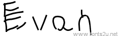
Font name: Evan
Font style: Regular
Basic font information
Font family: Evan
Font subfamily identification: Regular
Unique identifier: 1.000;PYRS;Evan
Full font name: Evan
Version: Version 1.000;PS 001.001;hotconv 1.0.56
Postscript font name: Evan
Trademark notice: Please refer to the Copyright section for the font trademark attribution notices.
Manufacturer name: PYRS Fontlab Ltd. / Made with FontLab
Designer: Nell May
Evan
Regular
- Styles
- Charmap
- Evan
OTF (12.2 Kb)


Read more
Evan : A child typeface
Designed by Nell May (www.nellmay.com)
Released in the exhibition:
'There was once a typographer in all of us'
17 September – 15 October 2011
split/fountain (www.splitfountain.org)
Typography is considered to be a specialist field, one that most of us don’t dedicate much thought to. When we read, the complexities of letters and their arrangements often escape our scrutiny. We take them for granted. As children, however, we were all at some point something of a young typographer or type designer. To learn to write, we faced the initial task of carefully studying the letters of the alphabet and learning to form each one. Slowly we all mastered our own unique typeface.
Over time writing by hand becomes completely automatic to us. It is easy to forget that handwriting is a skill, one that does not come naturally, but rather, one that is slowly developed and ingrained in us in our younger years. As we learn to write, the aim is to ultimately acquire a balance of legibility and speed, and for this process to become entirely habitual. It is with a certain poignancy that the point at which many children finally achieve this aim is probably also the point at which most cease to be actively engaged in typography, for having mastered writing itself, focus then shifts weight to the writing’s content.
Notes on Evan:
The typeface Evan stemmed from an investigation into common issues that arise when children are developing their handwriting. Each letter sample chosen to inform Evan contained at least one element in its formation that is generally considered to be problematic for writing.
Evan is based on lettering by children aged 5 – 8. Overall, there were three main reasons for why a letter sample was selected:
1). The letter lacked certain identifying visual features. Either, the letter’s construction was so loose that it verged on losing its form, such as the letter sample ‘e’, or essential features were missing and the resulting form risked being confused with other letters, as seen with the letter sample ‘s’. Other examples arose when the letter had been confused with its capital version, which is evident in the letter sample ‘w’, or when the letter had been inverted, such as with the letter sample ‘c’.
2). The letter had been formed in a manner that is impractical for its construction. For example, the letter was composed of unnecessary strokes or movements, as depicted in the letter samples ‘E’ and ‘Z’ respectively; or the letter showed an unusual construction such as with the letter samples ‘p’ and ‘g’.
3). The letter had been formed in a manner that is impractical for writing. For example, forming the letter from right to left instead of left to right, as with the letter sample ‘H’. Similarly, forming the letter from the bottom to the top instead of the top to the bottom, as with the letter sample ‘o’, where its circular shape was begun and completed towards the bottom. The issue with these methods of construction is that they end with the pen or pencil in a location from which it is not ideal for the writer to continue to draw a subsequent letter. This can then be a hinderance for learning cursive handwriting as well as for simply trying to write at a proficient pace.
Each letter sample was traced using a separate stroke to correspond to each line the child drew. Given that each sample was produced by a different child, with a different writing utensil, and at a different scale, this method was preferable to using original scans as it offered consistency. This method was also chosen to help direct focus to the form of the letter, rather than the pressure of the pen or pencil. Due to the differences in the children’s handwriting, both the size of the letters and the spacing between them were not taken into account when choosing samples.* Minor adjustments were also made to the sizing and positioning of the letters to enable a sense of uniformity for the typeface as a whole. This was balanced against an effort to maintain the integrity of the original samples.
Evan is a near complete and functional typeface. Samples of all the lowercase, uppercase and number characters were found, as was a full stop. All other characters are missing from the typeface.
*
An exception for this is the sample for the number ‘0’, which was chosen specifically because of its size in relation to the other numbers that particular child wrote.
- Font
- Alien
- Ancient
- Android fonts
- Animals
- Basic
- Blurred
- Brush
- Celtic
- Chalk Crayon
- Comic
- Curly
- Decorative
- Dingbats
- Distorted
- Dotted
- Eroded
- Esoteric
- Famous
- Fancy
- Font 3D
- Gothic
- Graffiti
- Grid
- Groovy
- Grunge/Trash
- Headline
- Italic
- Lefty
- Logos
- Mac OS
- Medieval
- Modern
- Old School
- Outline
- Retro
- Rounded
- Runes, Elvish
- Sans serif
- Scratched
- Script
- Shapes
- Stencil, Army
- Typerwriter
- Western
- Wild West
- Various
- Holiday
- Art
- Techno
- People
- Relax
- Foreign