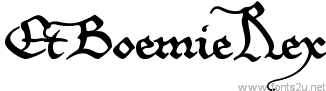
EtBoemieRex font
Font name: EtBoemieRex
Font style: Regular
Basic font information
Font family: EtBoemieRex
Font subfamily identification: Regular
Unique identifier: EtBoemieRex:Version 1.10
Full font name: EtBoemieRex
Version: Version 1.10 June 2010, initial release November 2007
Postscript font name: EtBoemieRex
Designer: Pia Frauss
Description: EtBoemieRex was created with the Font Creator Program from High-Logic.com
http://www.pia-frauss.de/fonts/fonts.htm
If you want to use this font commercially, please visit http://www.pia-frauss.de/imp/cu.htm
http://www.pia-frauss.de/imp/cu.htm
Nel Mezzo del Cammin di nostra Vita...
- Styles
- Charmap
- EtBoemRU
TTF (50.1 Kb)


Read more
EtBoemieRex
________________________________________________
... is a UNICODE font created by Pia Frauss in 2007, with High-Logic's FontCreator program, and updated in 2010. You have downloaded the 1.10 version.
I hope you'll enjoy this font.
EtBoemieRex is free for private use. For commercial use, please visit my "Conditions of Use" page at
http://www.pia-frauss.de/imp/cu.htm
The EtBoemieRex font is based on a charter issued in 1359 by the German/Roman emperor Charles IV, granting a market privilege to the city of Hambourg.
On the number sign of the EtBoemieRex font, you'll find a *long s*. The other special characters are
- an alternate *f* on the 'plus' sign, since the normal one will collide with the i and a lot of accented characters
- an alternate *d* on the 'bar' and 'broken bar' sign, less encumbrant than the normal one
- a double *l* on the left bracket
- an *fl* ligature on the right bracket
- a swashed *m* on the left curly bracket, to be used at the ending of a word
- a swashed *n* on the right curly bracket, to be used at the ending of a word
- a *long s*+*t* ligature on the long s sign
- an *ft* ligature, and a swashed *t*, on the fi and fl keys. If these characters aren't reachable on your computer, you might try the masculine and feminine ordinal indicators, or the 'less-than or equal to' and the 'greater than or equal to' signs.
- and, just in case, if you really need a 'plus' sign with this font, you'll find it on the 'plus/minus' sign.
UPDATE 2010 has redesigned all of the composite glyphs (correcting the *dcaron*, *L/lcaron*, and *tcaron*), and enlarged the dashes.
_________________________________
Disclaimer:
1. The designer as well as owner of this font is Pia Frauss.
2. This is a free font, but it is restricted to personal use only. Commercial use may be obtained by paying a licensing fee.
3. This font may not be included in any commercial compilation of fonts, be it on CD, disks or other products, without the owner's permission.
4. Altogether, this font may not be used for commercial ends and financial gain without the owner's permission.
5. This font may be freely distributed, as long as the zipfile, including this text, remains unaltered.
6. This font comes as it is. There is no warranty -- express or implied -- offered by the owner, or supplier. The risk of any losses or damages resulting from the use of this font remains wth the user.
If you need any information not supplied by this or by the http://www.pia-frauss.de/ website, please write to fonts @ pia-frauss.de (please remove the spaces around the *@* before copying the address into your mail form).
(However, please note that no enquiries such as "how do I download/install/get such and such program to work with your fonts" will be answered in the future.)
- Font
- Alien
- Ancient
- Android fonts
- Animals
- Basic
- Blurred
- Brush
- Celtic
- Chalk Crayon
- Comic
- Curly
- Decorative
- Dingbats
- Distorted
- Dotted
- Eroded
- Esoteric
- Famous
- Fancy
- Font 3D
- Gothic
- Graffiti
- Grid
- Groovy
- Grunge/Trash
- Headline
- Italic
- Lefty
- Logos
- Mac OS
- Medieval
- Modern
- Old School
- Outline
- Retro
- Rounded
- Runes, Elvish
- Sans serif
- Scratched
- Script
- Shapes
- Stencil, Army
- Typerwriter
- Western
- Wild West
- Various
- Holiday
- Art
- Techno
- People
- Relax
- Foreign